React Gradient Progress
Simple and light circular progressbar with gradient
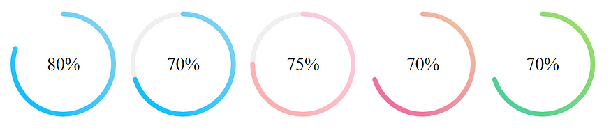
Installation
Using npm via terminal
$ npm login --registry https://r.privjs.com
$ npm i -S react-gradient-progress --registry https://r.privjs.com
Using CI/CD environments such as Netlify, Zeit, Travis CI, etc.
- Add
.npmrcfile to your project root with the following line://r.privjs.com/:_authToken=${NPM_TOKEN} - Set environment variable
NPM_TOKENwith yourPrivJs Tokenin your preferred CI/CD environment - That's all
Tutorial: Netlify, CI/CD Workflow, Github Actions, NpmJs
Basic Usage
import {CircleProgress} from 'react-gradient-progress'

<CircleProgress percentage={90} />
Props
| Name | Description |
|---|---|
percentage | Percentage progress. Required. |
width | Width of the progressbar container in px. Default: 200. |
strokeWidth | The stroke width of the progress bar. Default: 5. |
strokeLinecap | Stroke linecap type. Default: 'round'. Accepted values: 'butt', 'round', 'square' |
fontSize | The size of the percentage text. Default: '30px'. |
fontColor | The color of the font. Default: 'inherit'. |
fontFamily | Font family. Default: inherit. |
primaryColor | The Gradient color. Should be an array of size 2. Default: ['#00BBFF', '#92d7f1']. |
secondaryColor | The color of the uncovered percentage. Default: 'transparent'. |
fill | Color to fill in the progressbar. Default: 'transparent'. |